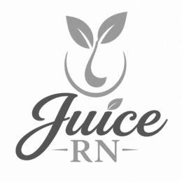
| Description of Mark | The mark consists of The logo for “Juice RN” features a clean, modern, and health-focused design centered around freshness and wellness. At the top of the logo is a stylized green sprout icon enclosed within a circular outline, symbolizing natural growth, vitality, nutrition, and rejuvenation. The sprout uses two leaves with smooth, flowing curves to create an organic and approachable aesthetic.Below the icon, the word “Juice” appears prominently in an elegant cursive script font with a rich dark green gradient, conveying freshness, energy, and sophistication. A small leaf accent is incorporated into the lettering, reinforcing the natural and plant-based theme.Underneath “Juice,” the letters “RN” are displayed in a refined serif typeface in a lighter green shade, separated by minimalist horizontal accents on each side. The “RN” element subtly communicates professionalism, health, and wellness expertise, likely referencing a registered nurse background or health-centered brand identity.The overall color palette consists of varying shades of green on a clean white background, creating a fresh, organic, calming, and trustworthy visual identity associated with healthy living, wellness beverages, and natural nutrition. |