| Serial Number | 99434516 |
| Word Mark | SOLGANICK |
| Filing Date | Thursday, October 9, 2025 |
| Status | 641 - NON-FINAL ACTION - MAILED |
| Status Date | Monday, March 2, 2026 |
| Registration Number | 0000000 |
| Registration Date | NOT AVAILABLE |
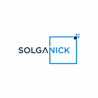
| Mark Drawing | 3 - Illustration: Drawing or design which also includes word(s) / letter(s) / number(s) |
| Published for Opposition Date | NOT AVAILABLE |
| Indication of Colors claimed | The color(s) Royal Blue, Black is/are claimed as a feature of the mark. |
| Description of Mark | The mark consists of The logo features the single word "SOLGANICK" presented in an all-capital, sans-serif typeface.The logo features the single word "SOLGANICK" rendered in an all-capital, sans-serif typeface.The first portion of the name, "SOLG A", is colored black against a white background.The letter "A" is distinct, featuring a high, pointed apex and a missing horizontal crossbar, giving it a stylized, angular or ∧ shape.The second portion of the name, "NICK", is colored a bright royal blue.The word mark is integrated with a geometric graphic element.A single-line square frame in the same royal blue color as "NICK" is positioned around the latter half of the word mark. The word "NICK" is centered within this open frame, and the frame has no solid fill.The square is incomplete, with the line segments failing to connect at the top-right corner.In the space where the corner is missing, there is a cluster of four small, solid squares (pixels). These pixels are arranged in a small, square formation.The top-right pixel in this cluster is colored black (matching the "SOLG A" portion). The remaining three pixels are filled with the white background color.The logo is a two-tone design using black and royal blue against a white background. It presents a clean, modern, and technical look, visually connecting the name with an abstract symbol of data or digitalization. The graphical element draws attention to the "NICK" portion of the word mark. |
| Goods and Services | Financial consulting and advising in the field of mergers and acquisitions; Merchant banking and investment banking services |
| International Class | 036 - Insurance; financial affairs; monetary affairs; real estate affairs. |
| US Class Codes | 100, 101, 102 |
| Class Status Code | 6 - Active |
| Class Status Date | Thursday, October 9, 2025 |
| Primary Code | 036 |
| First Use Anywhere Date | Friday, January 20, 2023 |
| First Use In Commerce Date | Friday, January 20, 2023 |
| Party Name | Solganick and Company Inc |
| Party Type | 10 - Original Applicant |
| Legal Entity Type | 03 - Corporation |
| Address | Plano, TX 75024 US |
| Event Date | Event Description |
| Thursday, October 9, 2025 | NEW APPLICATION ENTERED |
| Thursday, October 9, 2025 | APPLICATION FILING RECEIPT MAILED |
| Wednesday, February 25, 2026 | NEW APPLICATION OFFICE SUPPLIED DATA ENTERED |
| Wednesday, February 25, 2026 | NOTICE OF DESIGN SEARCH CODE E-MAILED |
| Thursday, February 26, 2026 | ASSIGNED TO EXAMINER |
| Monday, March 2, 2026 | NON-FINAL ACTION WRITTEN |
| Monday, March 2, 2026 | NON-FINAL ACTION E-MAILED |
| Monday, March 2, 2026 | NOTIFICATION OF NON-FINAL ACTION E-MAILED |