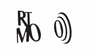
| Description of Mark | The mark consists of A. RTMO Composite LogoThe mark consists of the stylized letters “RT” stacked above “MO” in a modern, bold typeface. The geometric layout emphasizes movement and clarity while aligning with the brand’s athletic and lifestyle purpose.B. RTMO Icon (Wave Design)The icon consists of two stylized oval shapes arranged in a wave-like progression, inspired by the curvature of the letter "O" in RTMO. The design symbolizes motion, rhythm, and flow key pillars of the RTMO brand philosophy.IMPORTANT: Reference to Previous Application (Where I am also the owner)Serial No.: 99304121Mark: R RTMO ATHLETICSStatus: Approved with disclaimer for "ATHLETICS"; no conflicting marks found.This new application is a distinct evolution of the previously submitted mark, created in response to early-stage product testing, design trials, and consumer feedback.3. Justification for Design ChangeDuring the development and pre-launch phase of RTMO, we conducted visual and functional testing of the original trademark across multiple media formats primarily on-product printing, digital usage, and merchandising. The original “R” symbol with the three stacked dots, while conceptually aligned with the brand’s rhythm narrative, proved to be visually unbalanced, especially when scaled for garment prints, labels, and embroidery.Additionally:The combination of the abstract “R” and the dot pattern lacked clarity and did not resonate with the minimalist, high-performance aesthetic of the brand.Feedback showed it distracted from the core brand identifier: RTMO.The three-dot motif caused crowding issues and inconsistencies in application across apparel types and textures.As a result, we streamlined the identity:Removed the “R and three dots” to enhance visual clarity and brand consistency.Retained the core RTMO lettering in a modern stacked format that scales cleanly across digital and physical use.Developed a separate icon derived from the letter “O” in RTMO two stylized ovals forming a wave-like motion—to preserve the brand’s rhytm and motion symbolism in a simplified form. |
