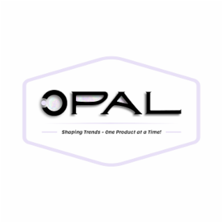
| Description of Mark | The mark consists of The OPAL wordmark may be used on its own or paired with theofficial tagline. When used together, the only approved lockupfeatures the wordmark with the tagline “Shaping Trends – OneProduct at a Time!” placed directly beneath it. Thisconfiguration must always appear as a unified element andshould not be altered.The structure, spacing, and alignment between the wordmarkand tagline must remain consistent. Do not rephrase the tagline,change its typeface, or modify its placement. The lockup shouldalways reflect brand-approved typography and proportions.Approved color options for the lockup are Black, White, orLight Purple (#e8e1f7), selected based on contrast with thebackground. Any special applications or deviations from thestandard format require prior approval from the brand team.“Shaping Trends – One Product at a Time!” is the officialbrand promise of OPAL. This statement captures the essenceof the brand’s mission: to introduce and lead with products thatreflect current demand and future-forward appeal. It is asingular, unified phrase and must always appear in its completeform.The tagline may not be broken into parts, paraphrased, orreplaced with alternative wording. For example, substitutionssuch as “One Trend at a Time” are not permitted under anycircumstances. Additionally, the phrase “One Product at aTime” should never appear in a larger size or more prominentstyle than “Shaping Trends”, as doing so alters the intendedbalance and meaning.While the tagline is often used in conjunction with the logo, itmay also appear independently within product descriptions,marketing copy, or campaign messaging — provided it ispresented exactly as approved, without modifications.OPAL’s typefaces have been thoughtfully selected to reflect the brand’s balance of trend-forward aesthetics and timeless clarity. Eachfont serves a distinct role in the communication hierarchy, ensuring both visual appeal and functional readability across all platforms.AntonioUsed exclusively for headlines and prominent titles, Antonio is a bold, condensed sans-serif typeface that conveys strength,sophistication, and modernity. Its clean lines and tall letterforms command attention and create a striking presence across both print anddigital materials. To preserve its visual impact and alignment with brand aesthetics, Antonio should always be presented in all capitalletters. It is best suited for use in packaging headers, website banners, promotional materials, and section titles where strong visualhierarchy is needed.LemonadaLemonada brings a soft, expressive quality to the OPAL brand. With its fluid curves and warm personality, it is ideal for brandedsubheadings, taglines, and messaging that benefits from a more conversational or lifestyle-oriented tone. While visually engaging, itmaintains readability and balance when used thoughtfully in moderation. Lemonada is especially effective in reinforcing the approachableand trend-driven character of OPAL, complementing the strength of Antonio without competing for visual dominance.Times New RomanA classic serif font, Times New Roman is reserved for body text, product descriptions, legal disclaimers, and other forms of long-form or information-heavy content. Its familiarity and legibility make it ideal for ensuring clarity across diverse audiences and platforms.Times New Roman brings a sense of structure, heritage, and credibility to the OPAL brand — making it the preferred choice for detailedcommunication where tone and trust matter. It provides a grounded foundation that balances the more expressive styles of Antonio andLemonada. |