| Serial Number | 99696450 |
| Word Mark | H.O.P.E. FOR HEALING INSTITUTE H.HYPERBARIC-O.OXYGEN-P.PROVIDING-E.ENERGY |
| Filing Date | Wednesday, March 11, 2026 |
| Status | 641 - NON-FINAL ACTION - MAILED |
| Status Date | Tuesday, July 14, 2026 |
| Registration Number | 0000000 |
| Registration Date | NOT AVAILABLE |
| Mark Drawing | 3 - Illustration: Drawing or design which also includes word(s) / letter(s) / number(s) |
| Published for Opposition Date | NOT AVAILABLE |
| Pseudo Mark | HYPERBARIC OXYGEN PROVIDING ENERGY FOR HEALING INSTITUTE HYPERBARIC OXYGEN PROVIDING ENERGY |
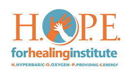
| Description of Mark | The mark consists of "The image is a logo with three lines of text and a circular graphic. The top line reads ""H.O.P.E."" in large, bold, orange sans-serif font. The letters H, O, P, and E are separate, with small orange dots between them. Within the circle graphic, which is a medium blue color, an orange adult hand is depicted from a top-down perspective. On top of the adult hand, a smaller white baby hand is resting. The baby's hand is reaching towards the adult's fingers, with the palm facing up. A thin, curved orange line forms a partial halo or arc around the hands, starting from the left and extending to the right, subtly enclosing the hand graphic.The second line of text reads ""forhealinginstitute"". The word ""for"" is in a teal blue, bold sans-serif font. The word ""healinginstitute"" is in a vibrant orange, bold sans-serif font. This line is positioned directly below the ""H.O.P.E."" line.The third and final line of text is a series of acronyms. It reads ""H.HYPERBARIC-O.OXYGEN-P.PROVIDING-E.ENERGY"". Each letter and its corresponding word are separated by a hyphen and a dot. The letters H, O, P, and E are in the same vibrant orange as the ""healinginstitute"" text, while the words ""HYPERBARIC"", ""OXYGEN"", ""PROVIDING"", and ""ENERGY"" are in a slightly darker shade of teal blue. This line is positioned below the ""forhealinginstitute"" line.The overall composition is clean and centered. The white background makes the colors of the text and graphic stand out prominently. The color palette consists of orange, teal blue, and white, conveying a sense of warmth, trust, and vitality. The imagery of the adult and baby hands suggests care, connection, and support, which aligns with the name ""HOPE for healing institute"". The acronym expansion provides further clarity on the services offered. The font choices are modern and legible.". |
| Goods and Services | Physician services and Hyperbaric physician services of medical grade hyperbaric oxygen therapy provided by a "premier hyperbaric medicine team", including "Doctor visits available for patients the same day by team of Medical director and Associate hyperbaric physician, 035- Advertising and marketing related to Physician services and Hyperbaric physician services of medical grade hyperbaric oxygen therapy, 035- Advertising services to Physician and Medical services |
| Indication of Colors claimed | The color(s) blue, orange, white is/are claimed as a feature of the mark. |
| International Class | 044 - Medical services; veterinary services; hygienic and beauty care for human beings or animals; agriculture, horticulture and forestry services. |
| US Class Codes | 100, 101 |
| Class Status Code | 6 - Active |
| Class Status Date | Wednesday, March 11, 2026 |
| Primary Code | 044 |
| First Use Anywhere Date | Monday, September 14, 2009 |
| First Use In Commerce Date | Monday, September 14, 2009 |
| Party Name | NOT AVAILABLE |
| Party Type | 10 - Original Applicant |
| Legal Entity Type | 01 - Individual |
| Address | San Rafael, CA 94901 US |
| Event Date | Event Description |
| Wednesday, March 11, 2026 | NEW APPLICATION ENTERED |
| Wednesday, March 11, 2026 | APPLICATION FILING RECEIPT MAILED |
| Thursday, July 9, 2026 | NEW APPLICATION OFFICE SUPPLIED DATA ENTERED |
| Thursday, July 9, 2026 | NOTICE OF DESIGN SEARCH CODE E-MAILED |
| Monday, July 13, 2026 | ASSIGNED TO EXAMINER |
| Tuesday, July 14, 2026 | NON-FINAL ACTION WRITTEN |
| Tuesday, July 14, 2026 | NON-FINAL ACTION E-MAILED |
| Tuesday, July 14, 2026 | NOTIFICATION OF NON-FINAL ACTION E-MAILED |